This project is still in active development
My Role
Product Designer
Main Deliverable
Website & Web App Design
Tools
Figma
Timeline
2 months
Overview
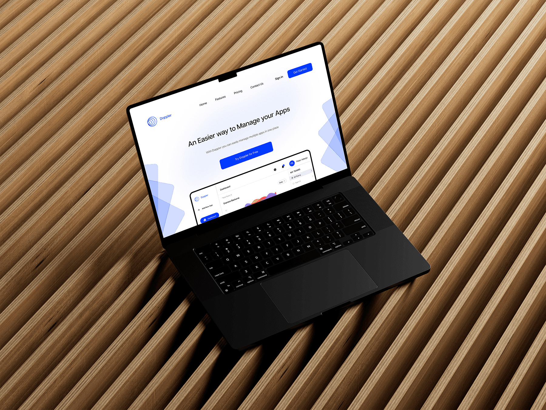
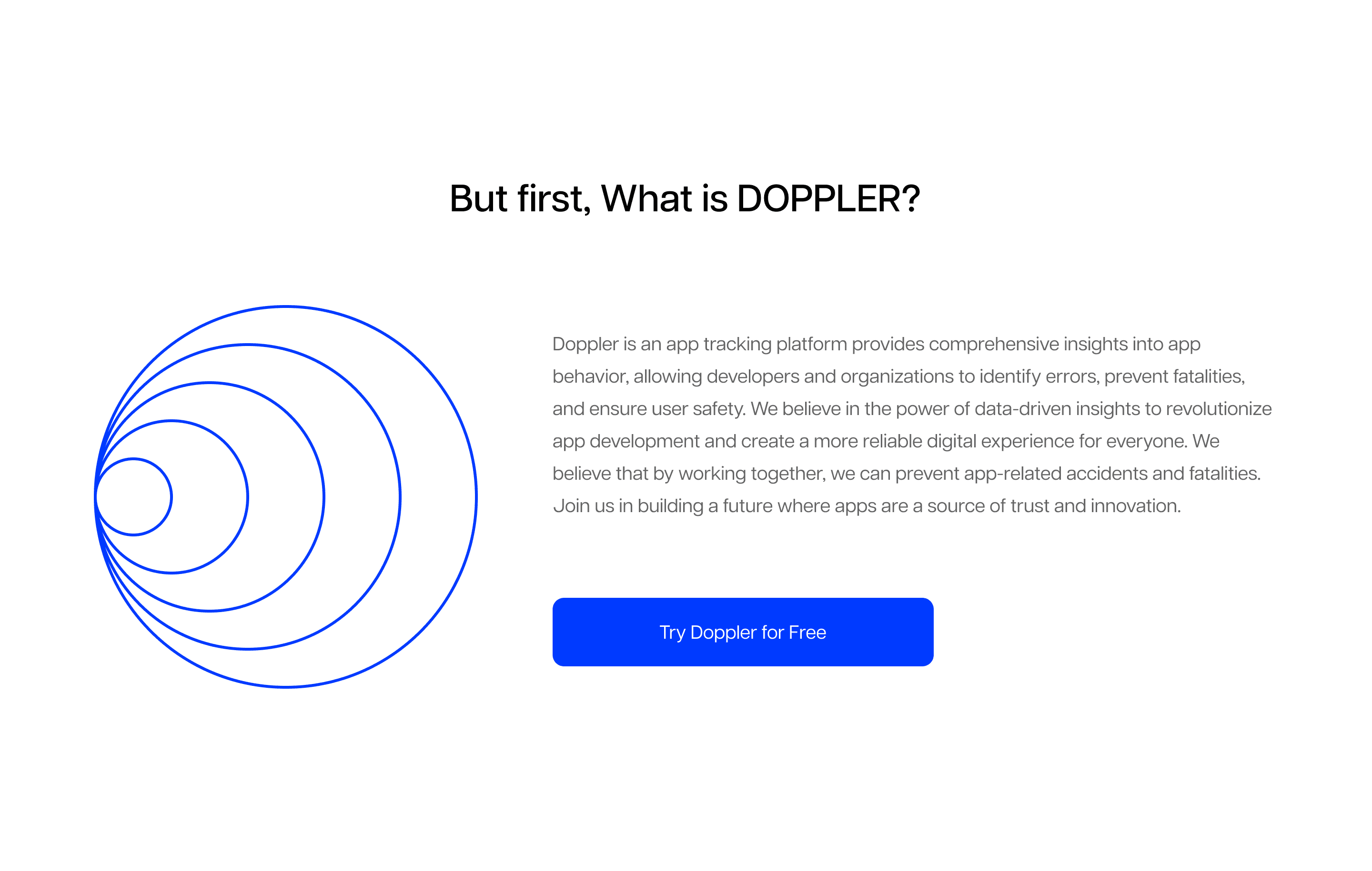
Doppler is a monitoring platform that helps teams track and manage system errors in real time. What was needed was a simple, intuitive dashboard that solved the complexity found in other tools.
My focus was on designing a clean interface, task integration flow, and responsive website and mobile view that made issue detection and resolution seamless.
The Challenge
Designing a monitoring platform that balanced simplicity with functionality was the biggest challenge. Most existing dashboards were cluttered and overwhelming, so the goal was to strip away unnecessary elements while keeping essential features accessible.
Integrating task management directly into the platform added another layer of complexity — the design needed to allow users to act quickly on detected errors without breaking workflow. Ensuring a consistent experience across web and mobile also required careful layout and component optimization.
Design Solutions
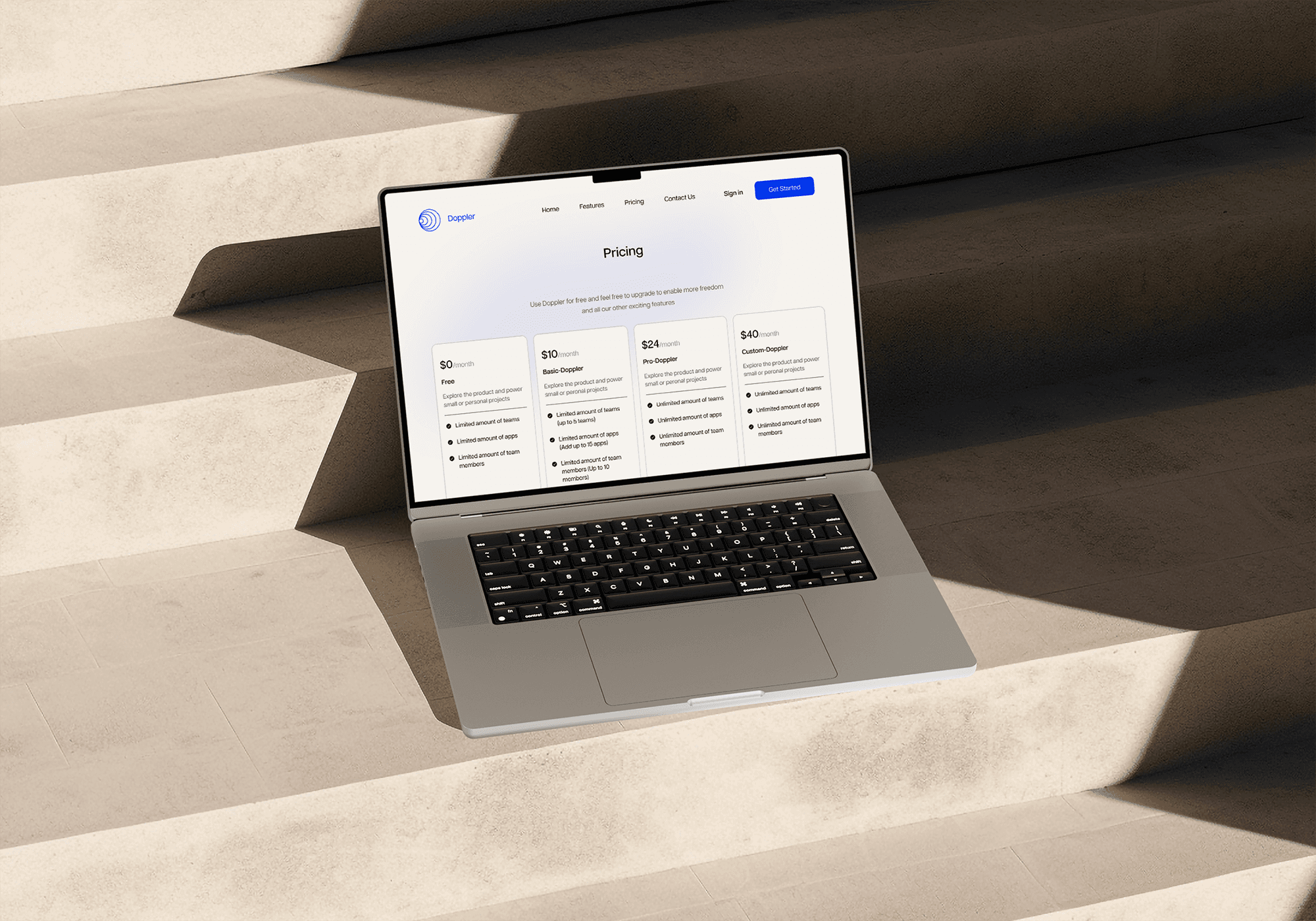
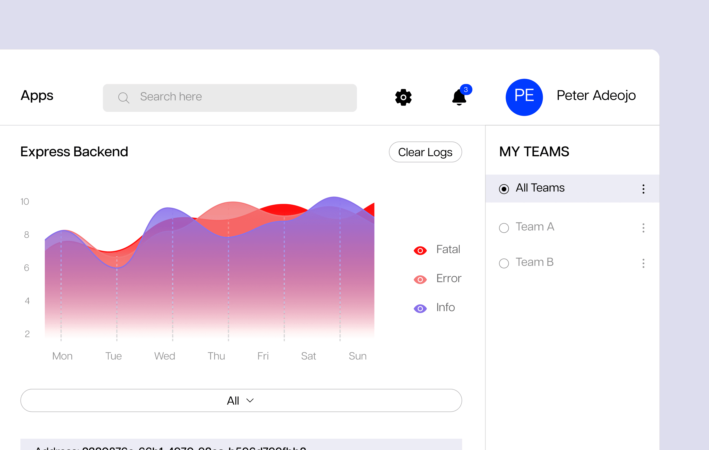
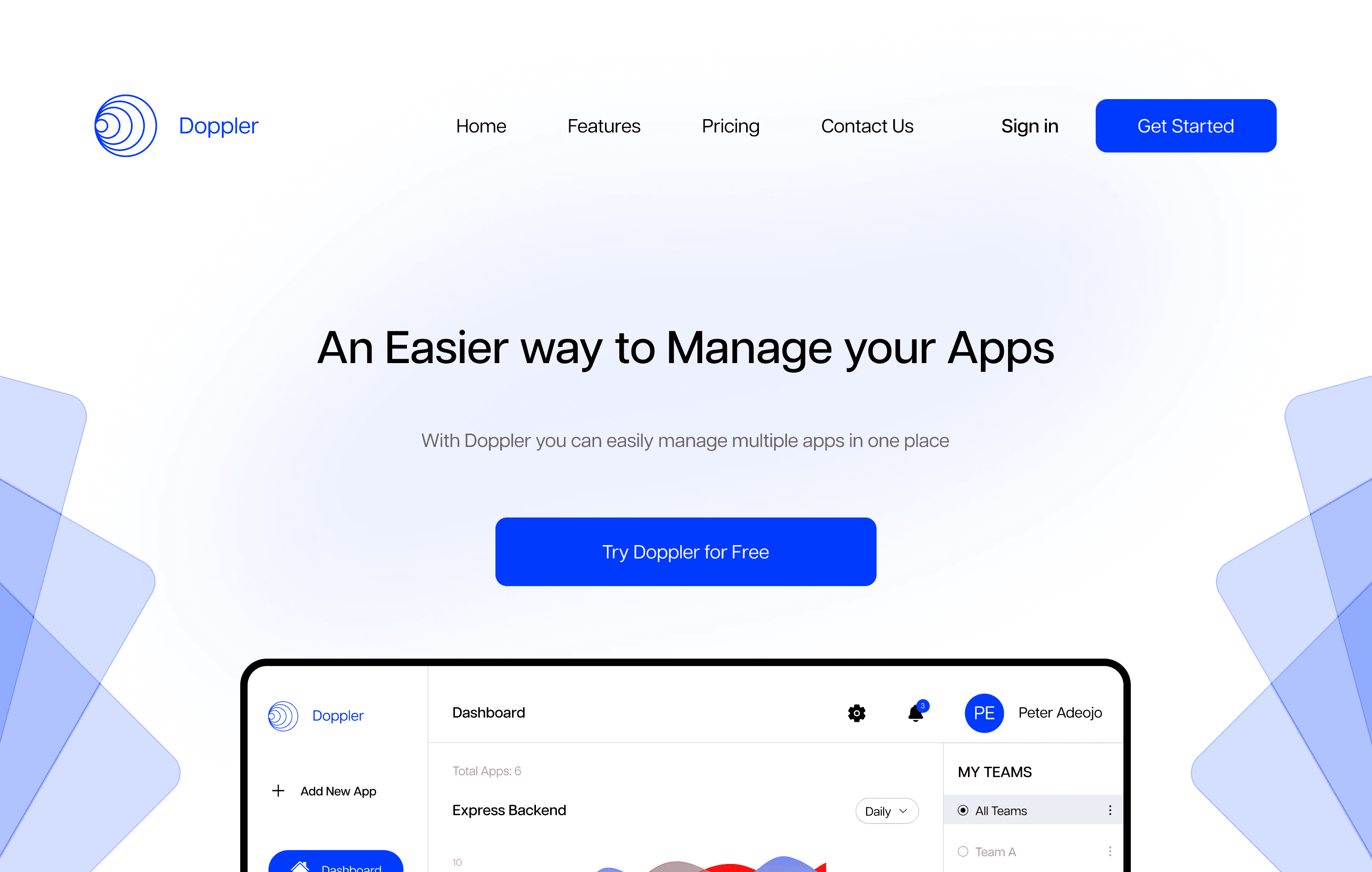
Doppler was designed as a simplified monitoring platform that gives developers clear visibility and control without unnecessary complexity.
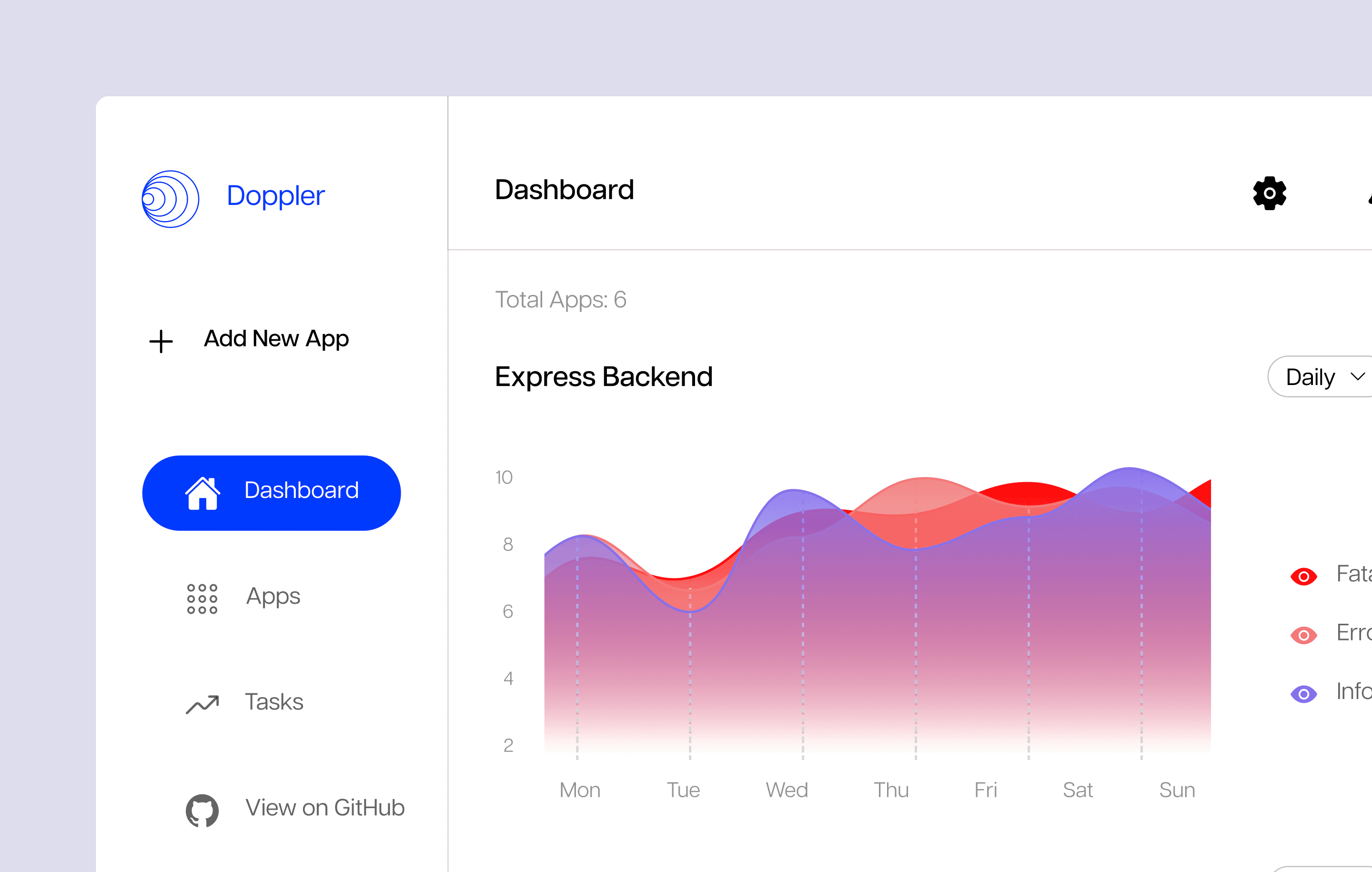
Simplified Dashboard
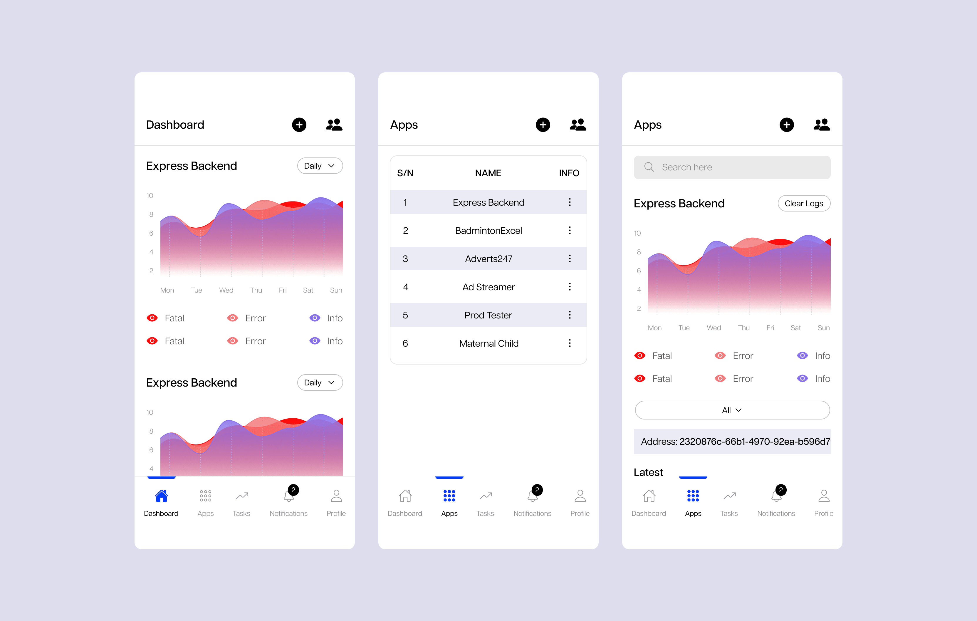
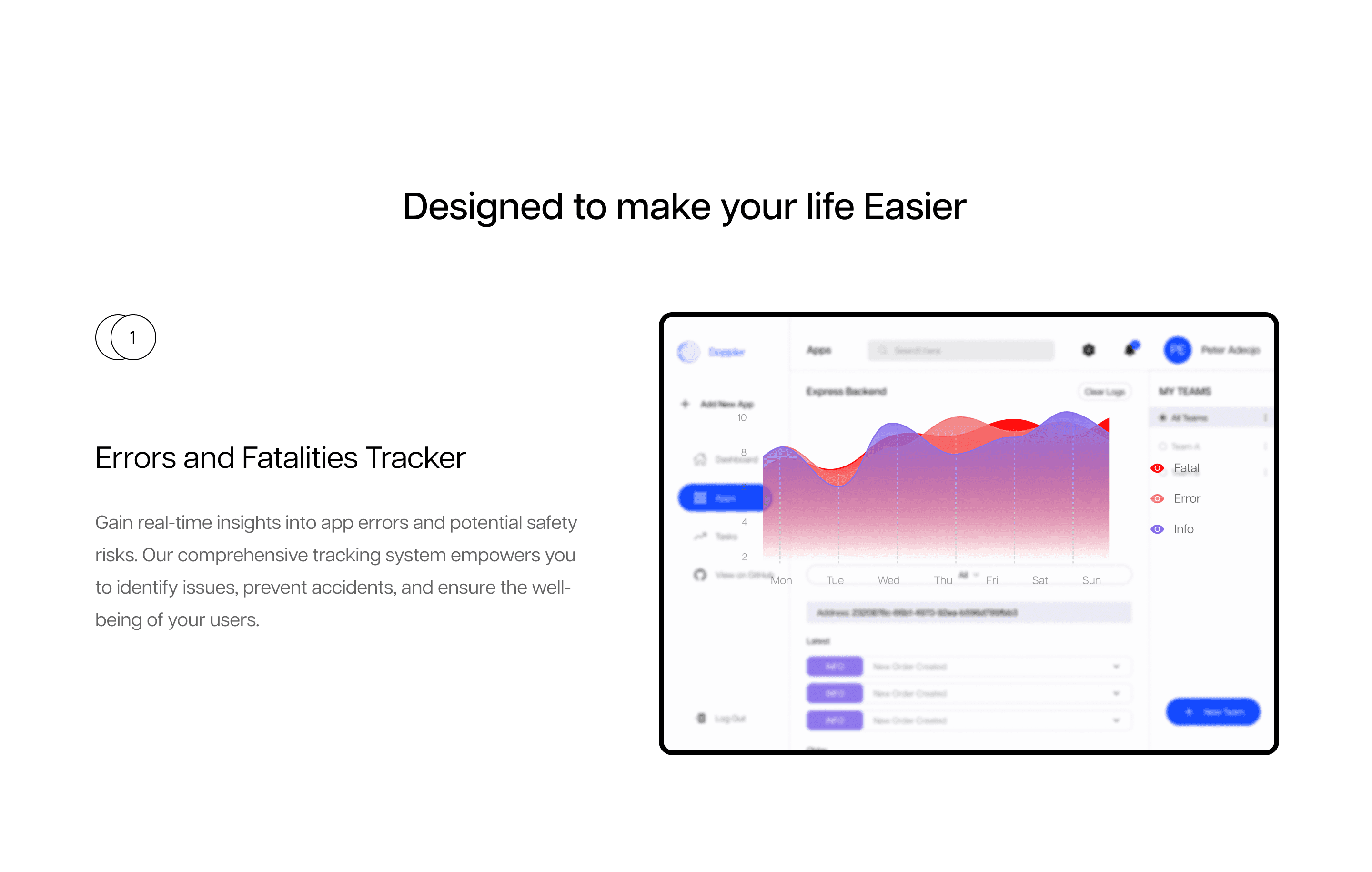
Streamlined Layout: Designed a minimal interface highlighting key error metrics and system health.
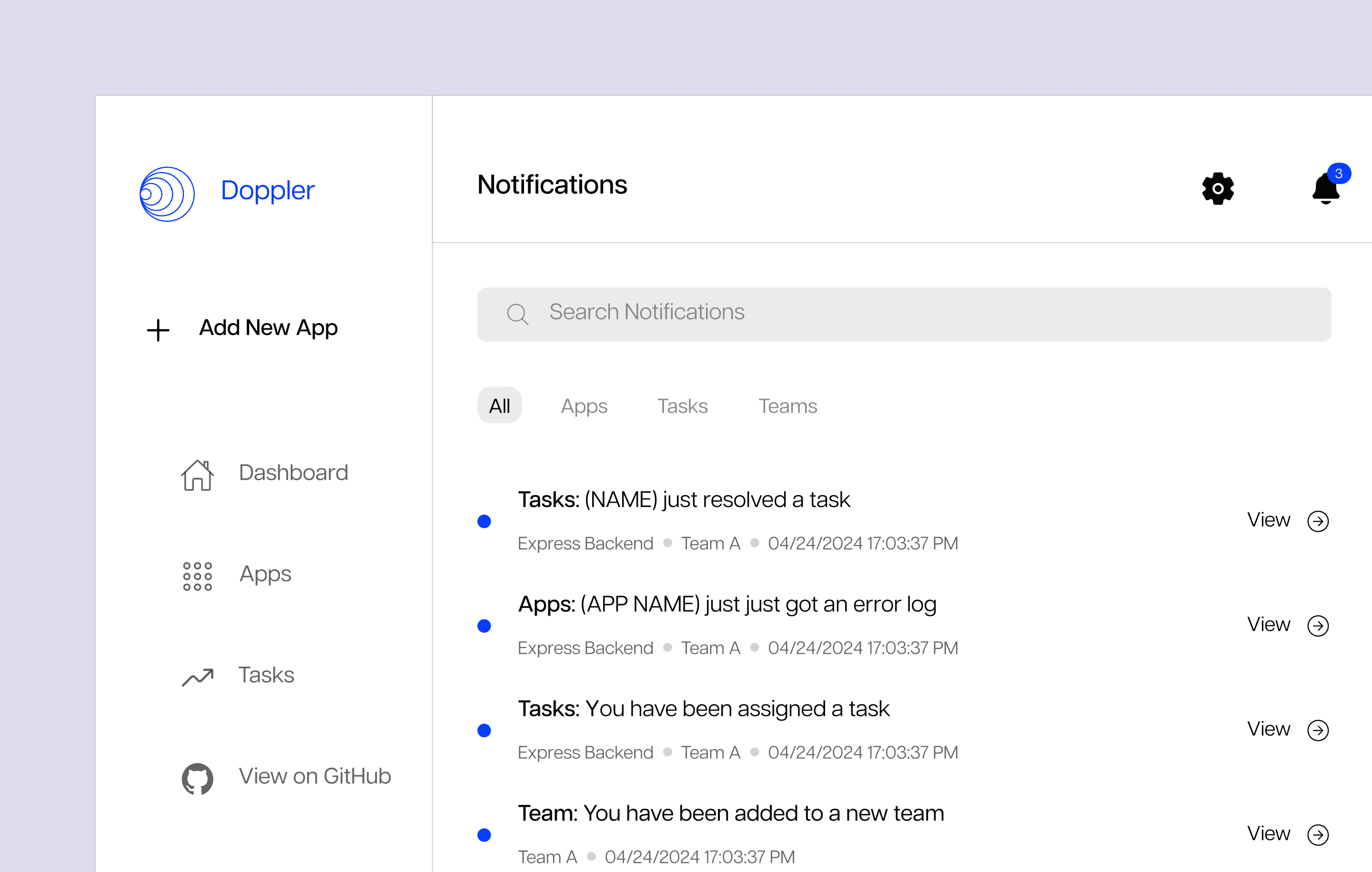
Quick Visibility: Prioritized real-time alerts and summaries for faster issue recognition.
Reduced Cognitive Load: Removed unnecessary data clutter to make the experience effortless for users.
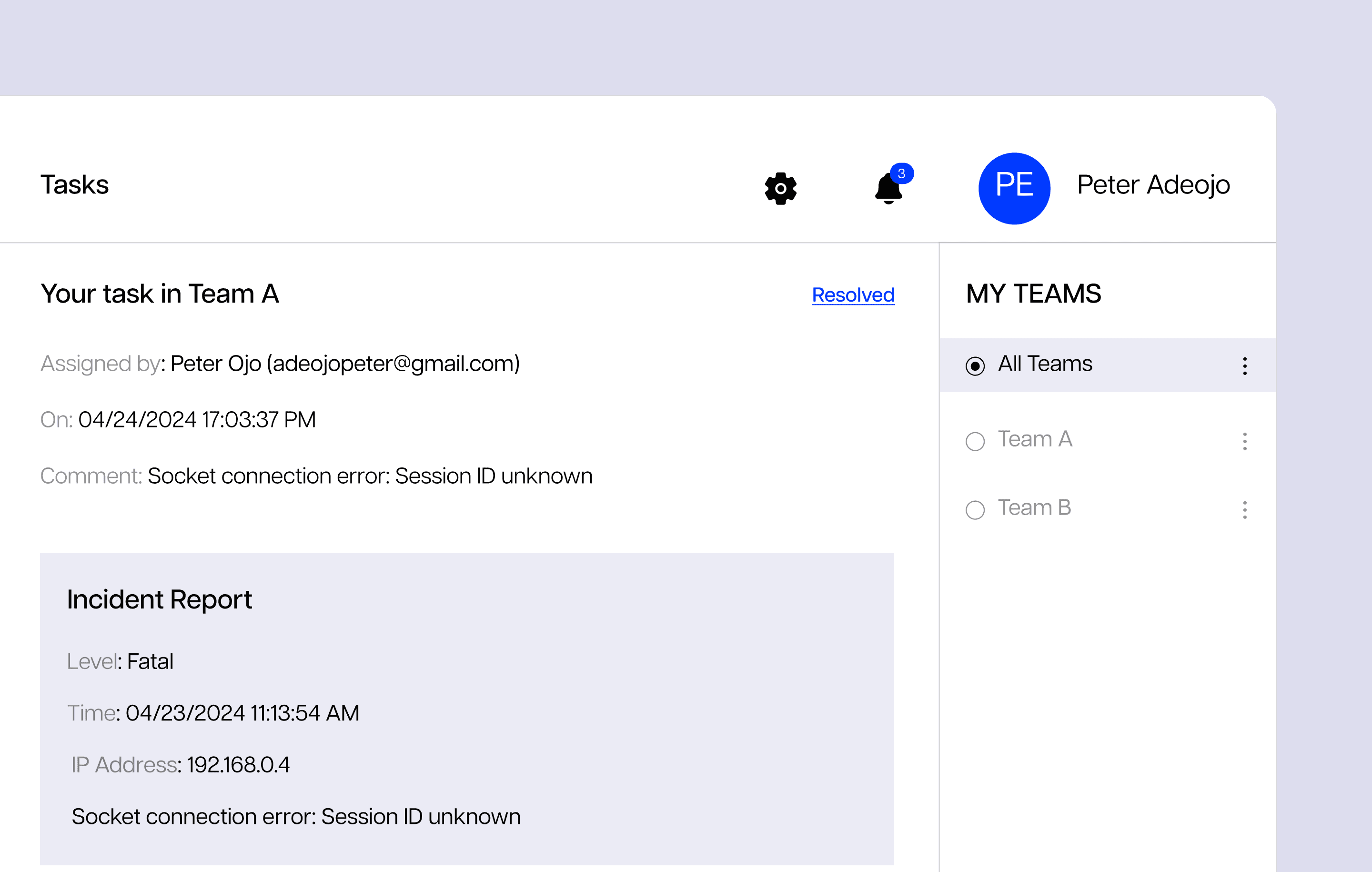
Task Integration System
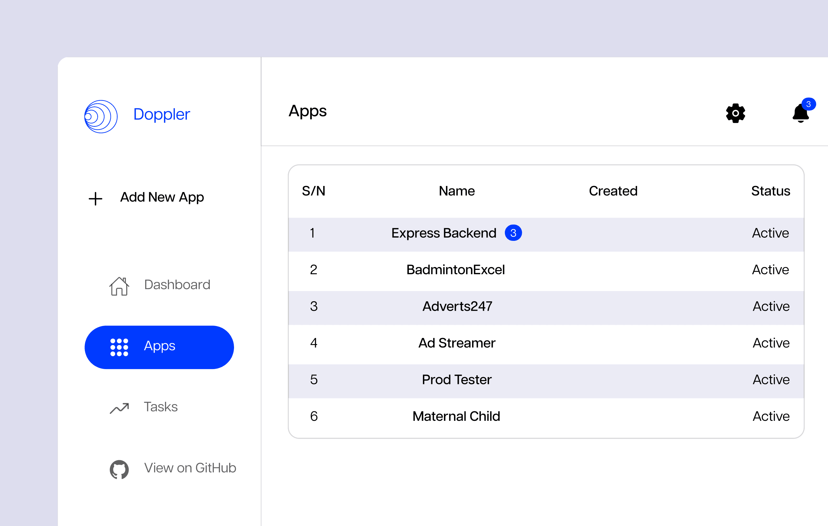
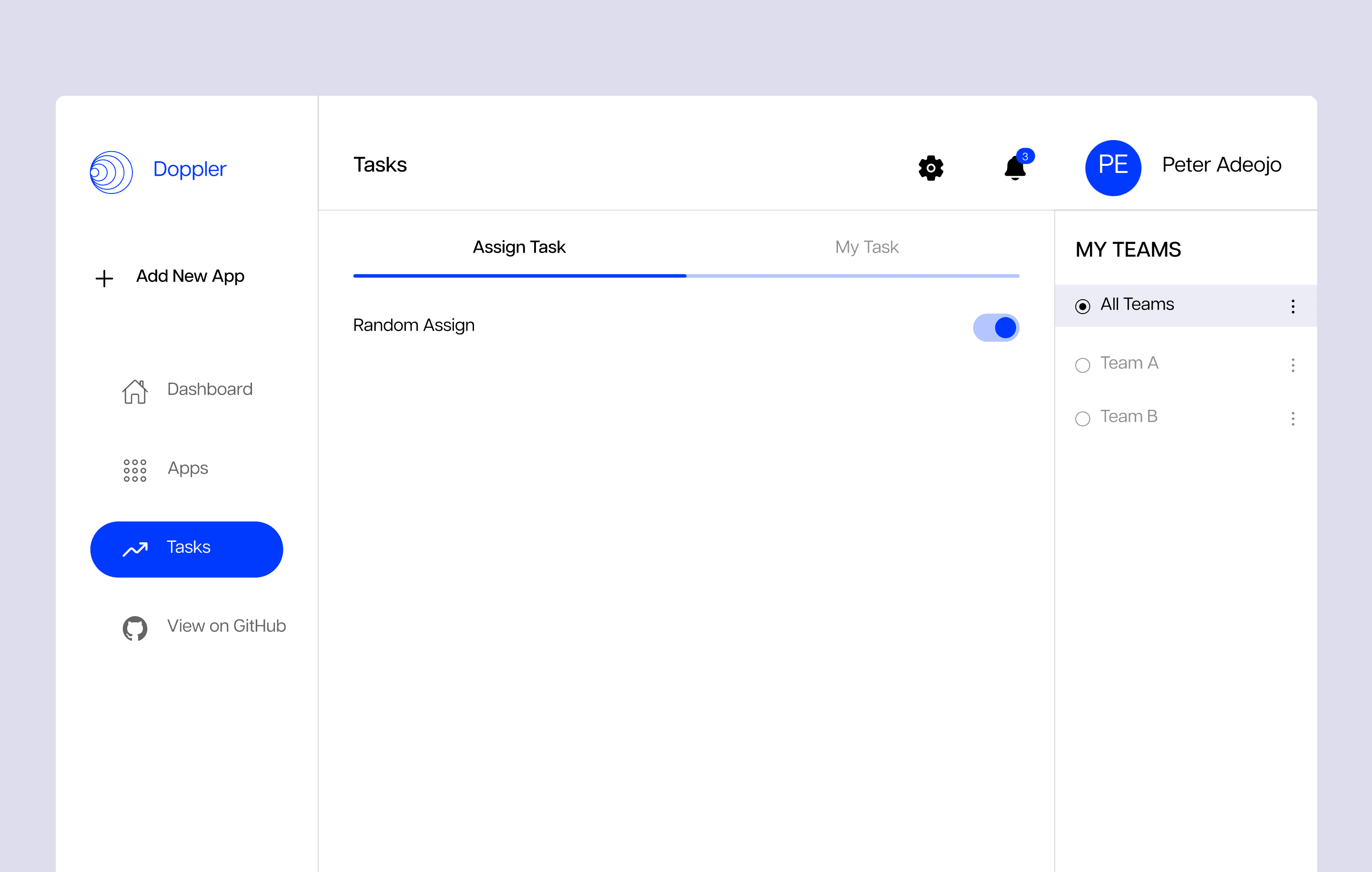
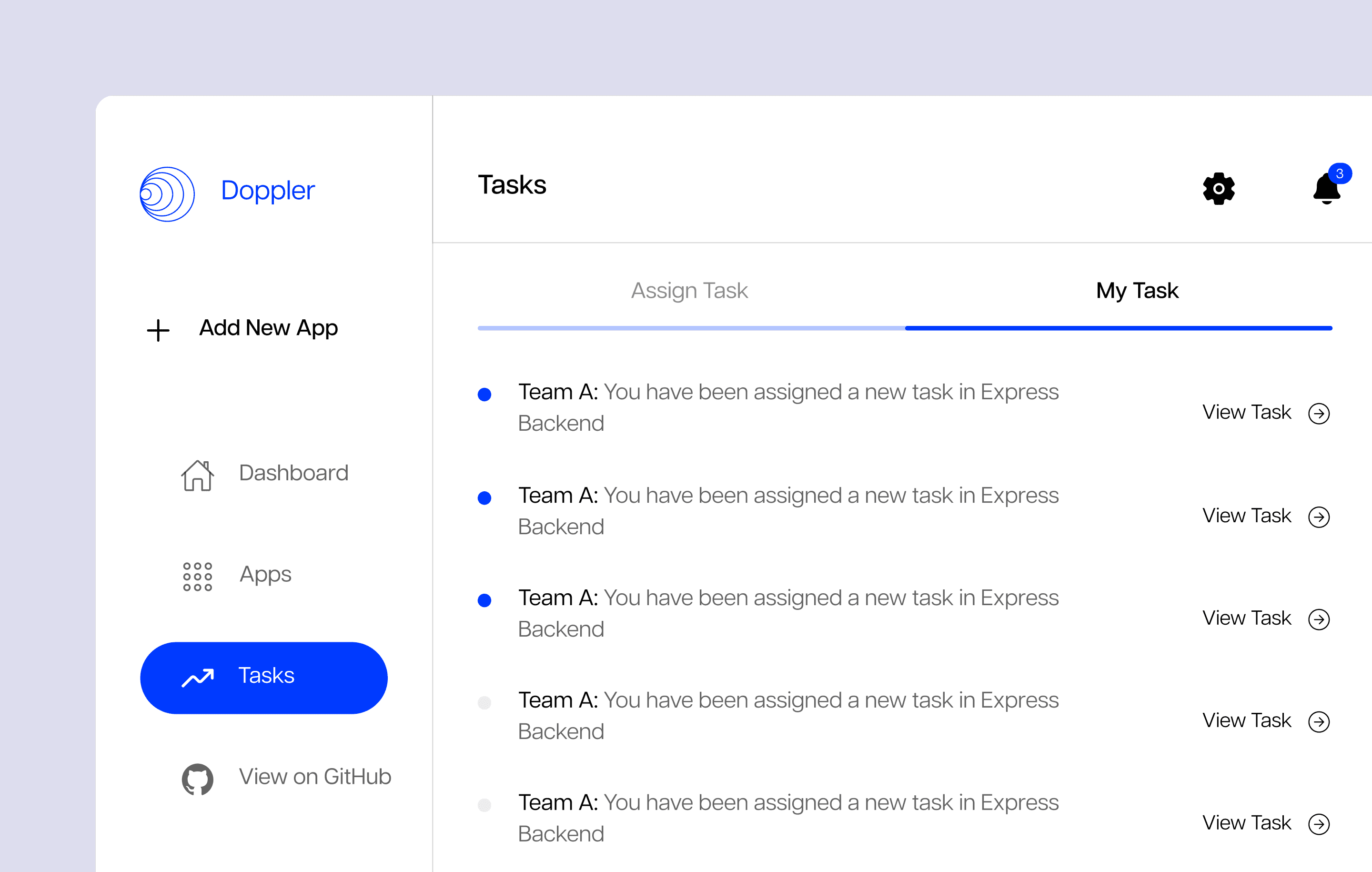
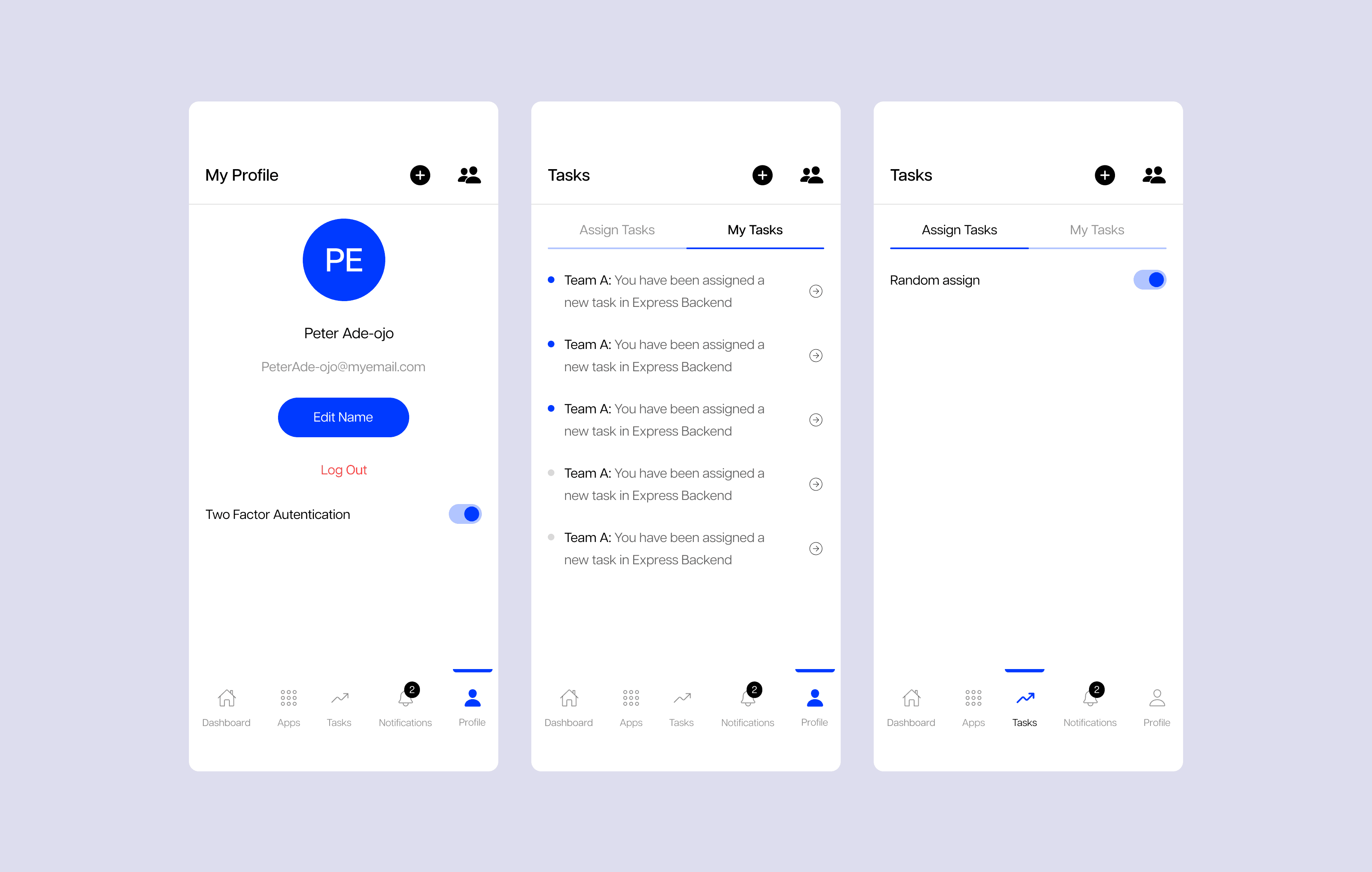
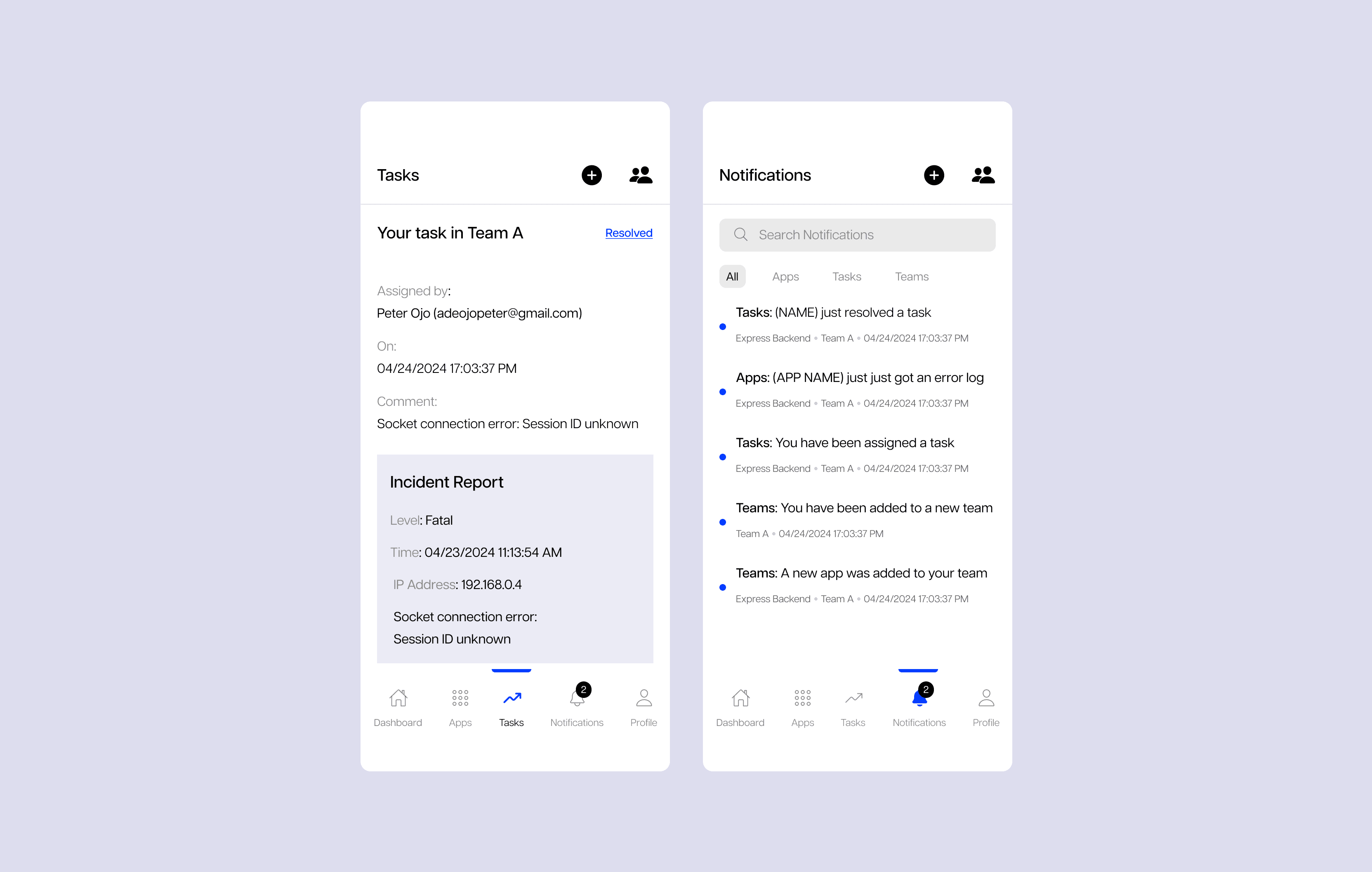
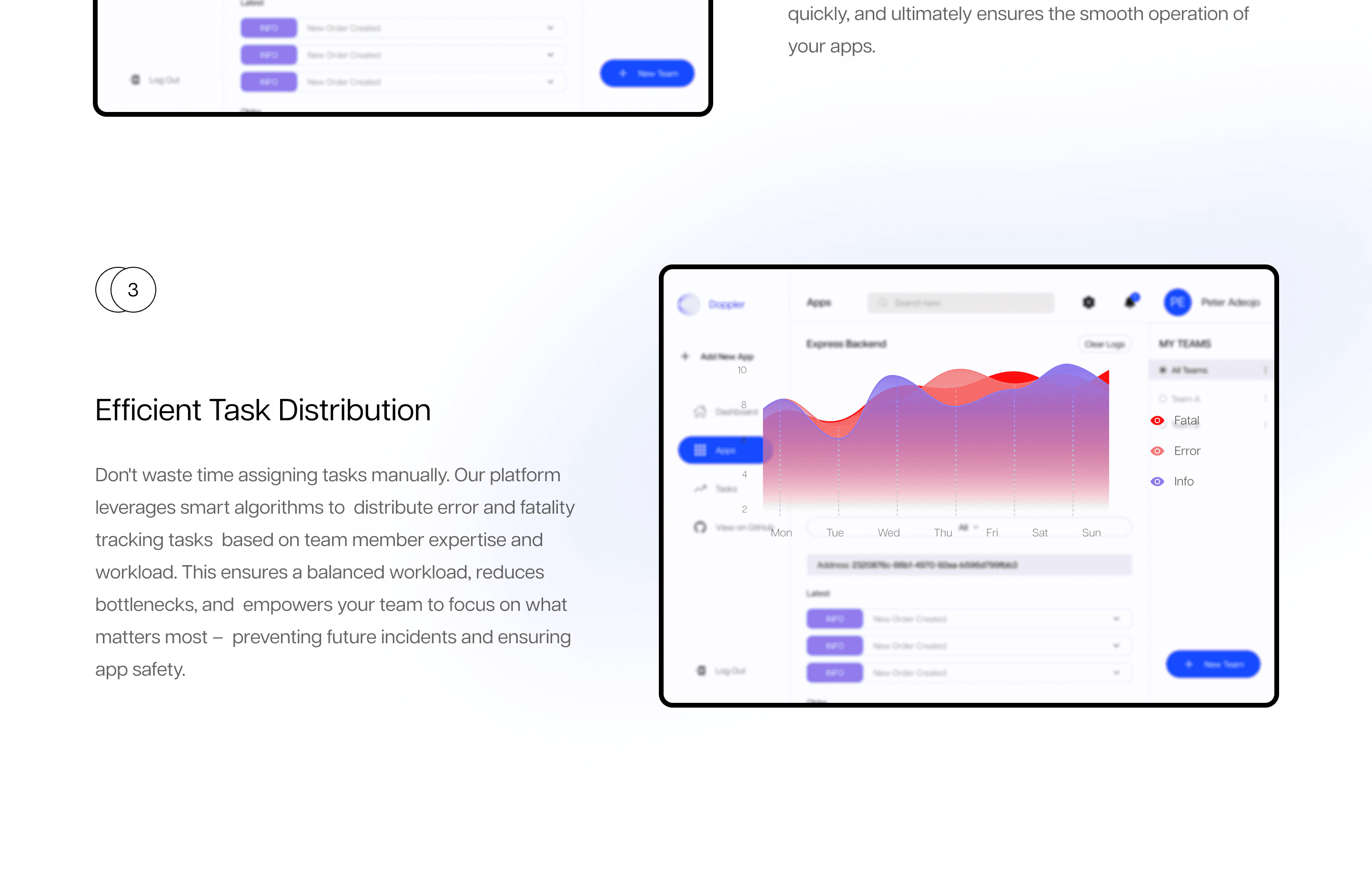
Post-Error Workflow: Enabled users to create and assign tasks directly after an error is detected.
Collaborative Design: Integrated simple tagging and status updates to improve team coordination.
Context Awareness: Linked every task to its corresponding error event for easier tracking.
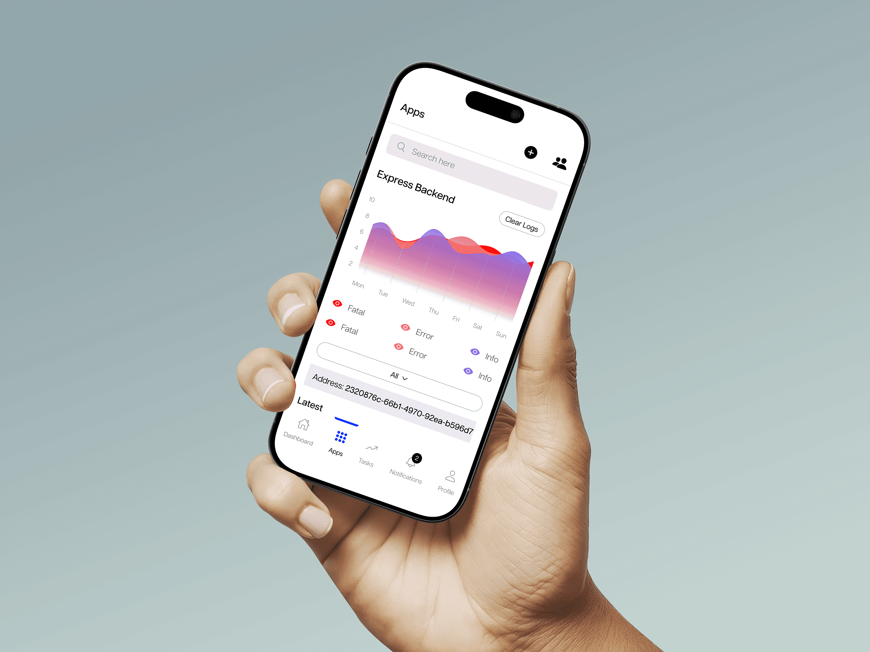
Responsive Web & Mobile Experience
Adaptive Design: Built layouts optimized for both desktop and mobile use.
Consistent Interface: Maintained visual and functional consistency across breakpoints.
Accessible Controls: Simplified navigation and component spacing for smaller screens.
Visual Hierarchy & Clarity
Emphasis on Priority: Used color, size, and spacing to highlight critical errors and action buttons.
Readable Typography: Chose clean, legible fonts for better data scanning.
Guided Interactions: Designed flows that help users act quickly without confusion.
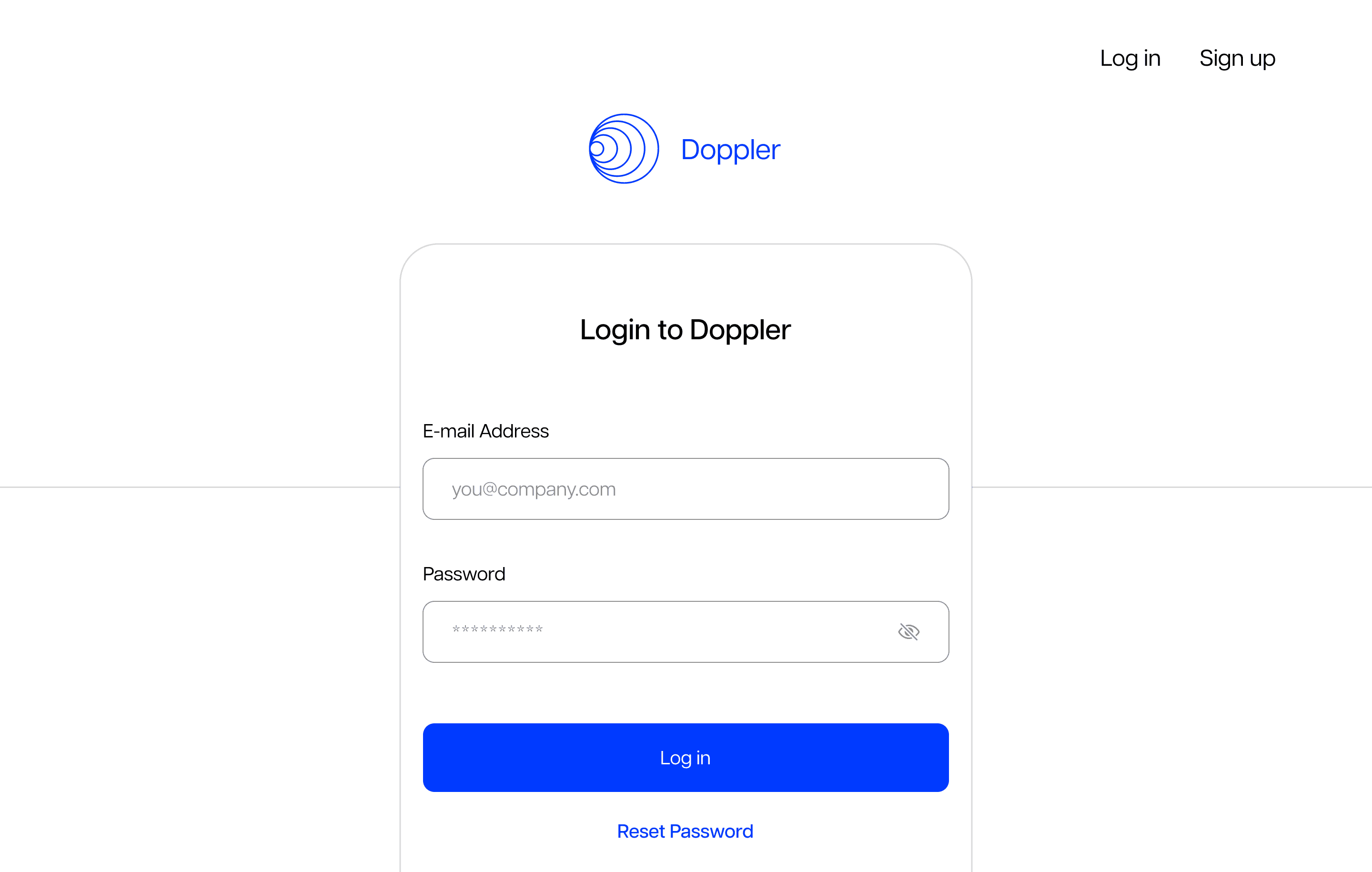
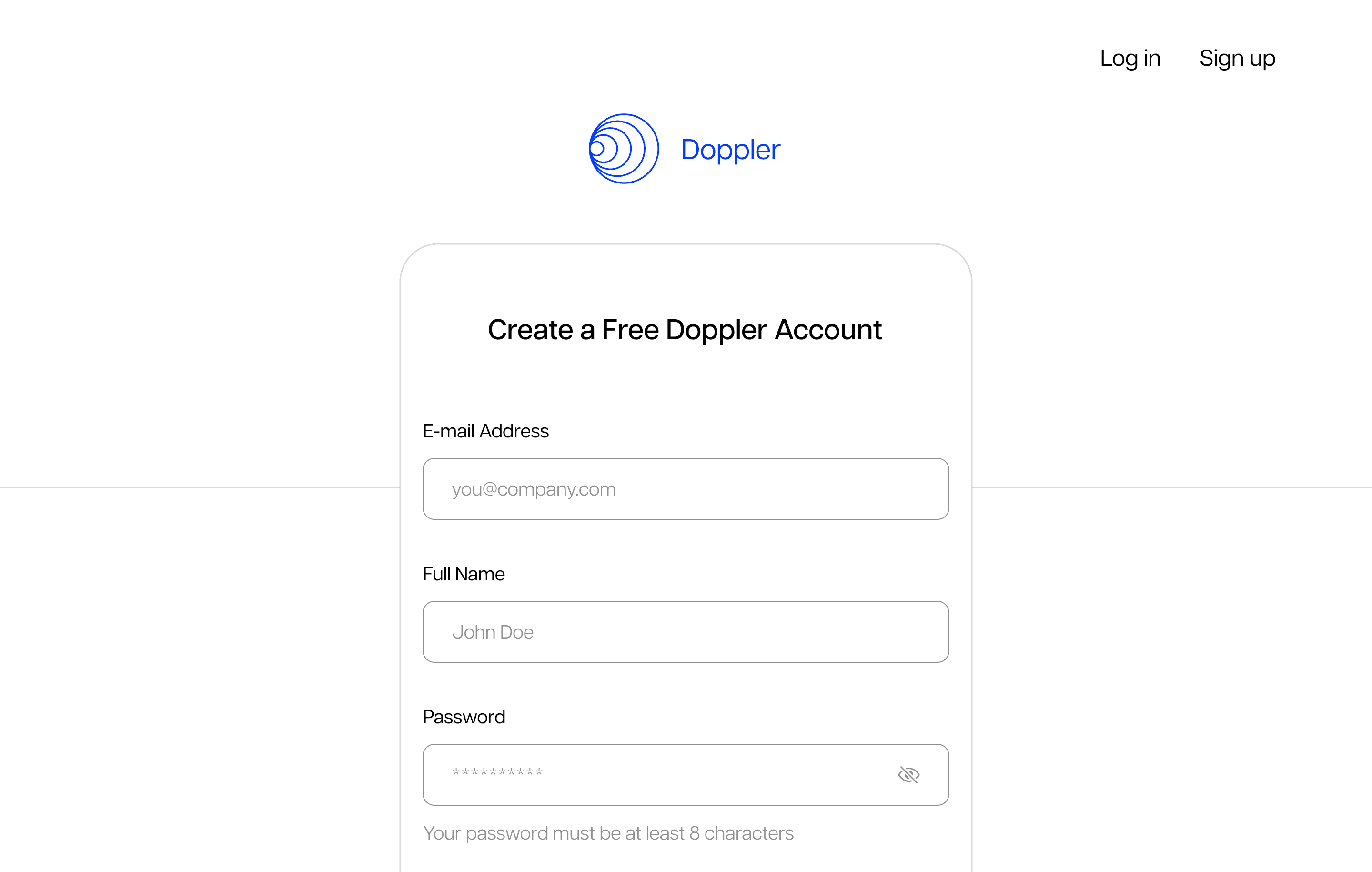
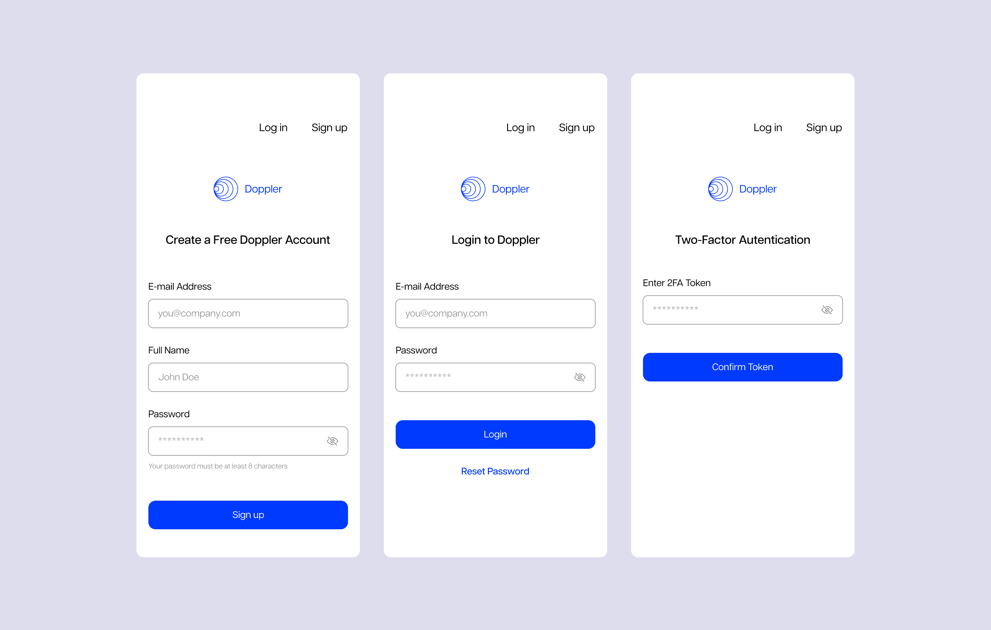
Smooth Login Flow
Frictionless Entry: Designed a short, intuitive login process with clear feedback states.
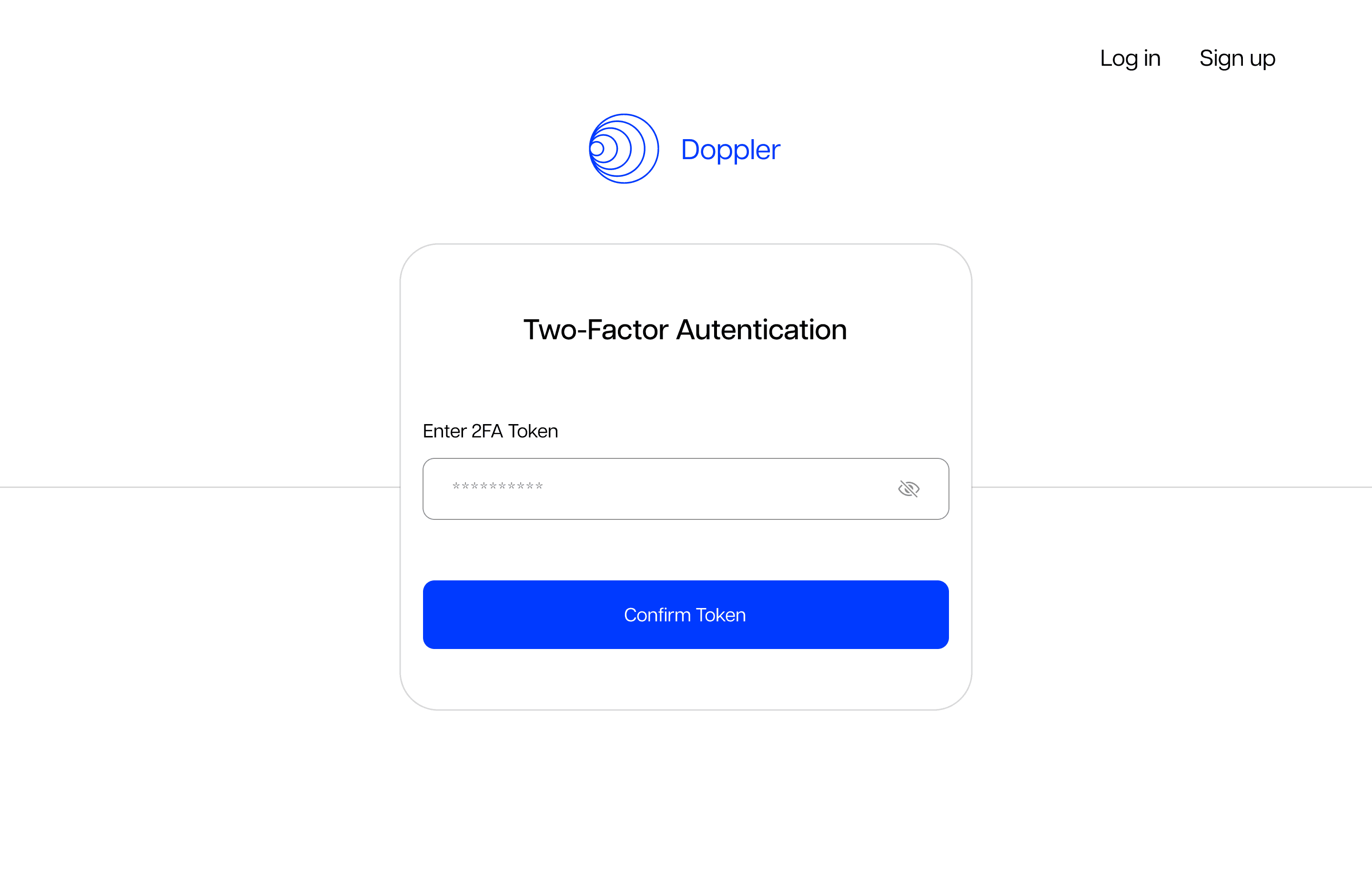
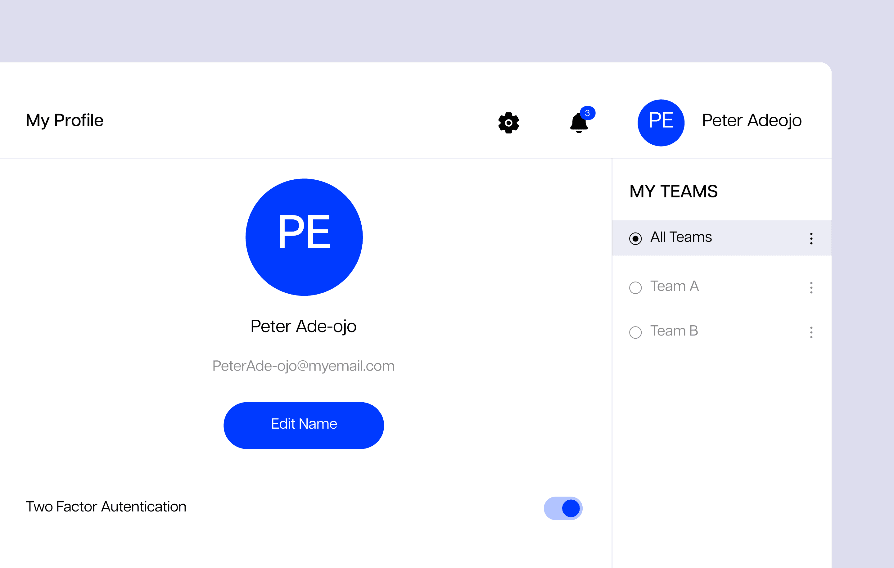
Secure Access: Implemented simple yet secure authentication patterns.
Instant Orientation: Directed users immediately to their project dashboard after sign-in to reduce bounce time.